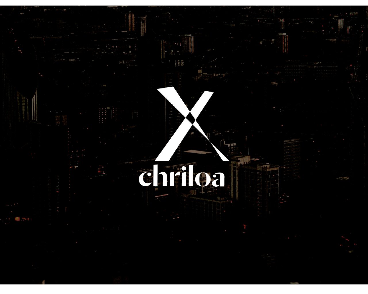
Chriloa
Industry: Construction/ commercial
Services Provided: Brand Idenity & Expression
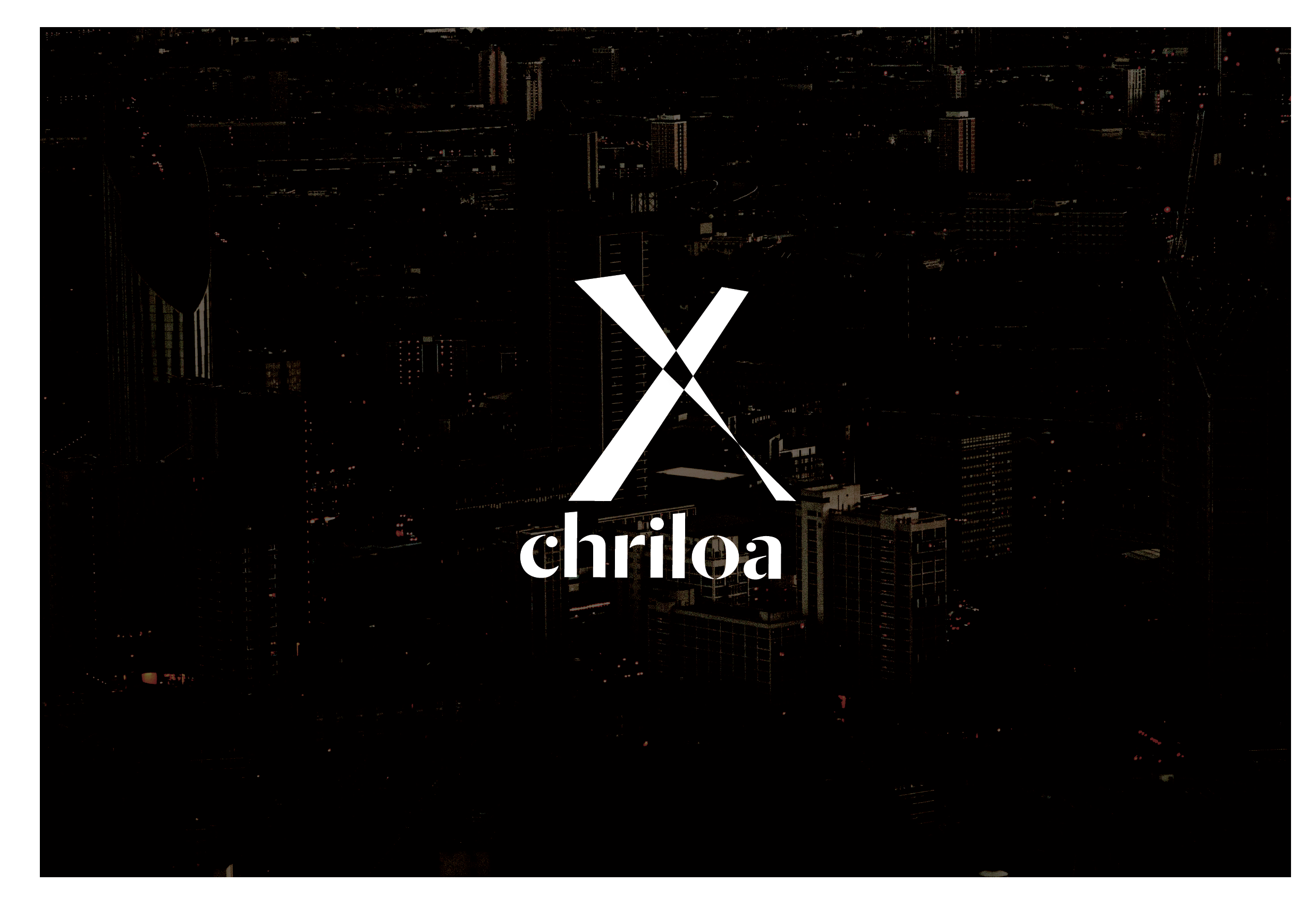
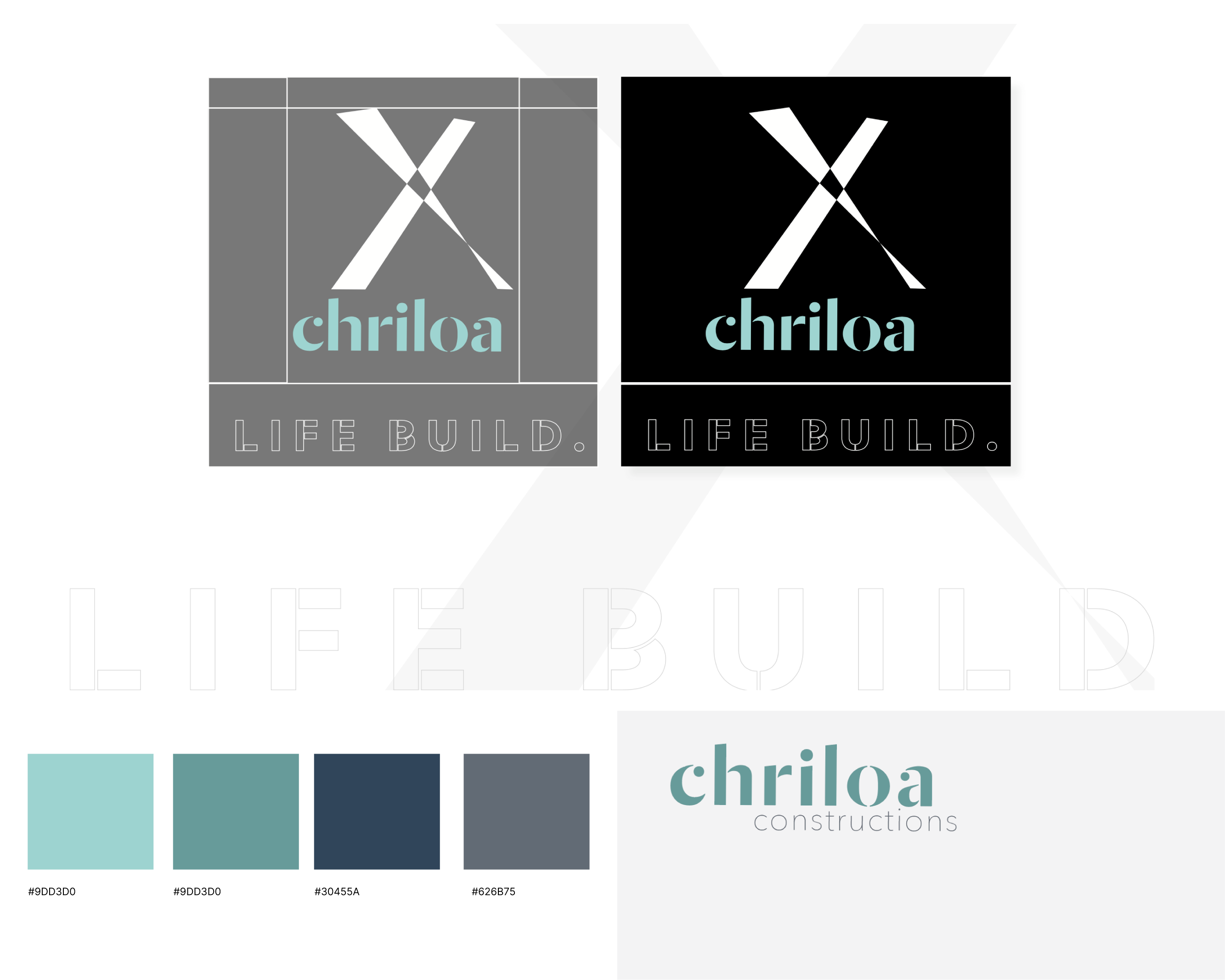
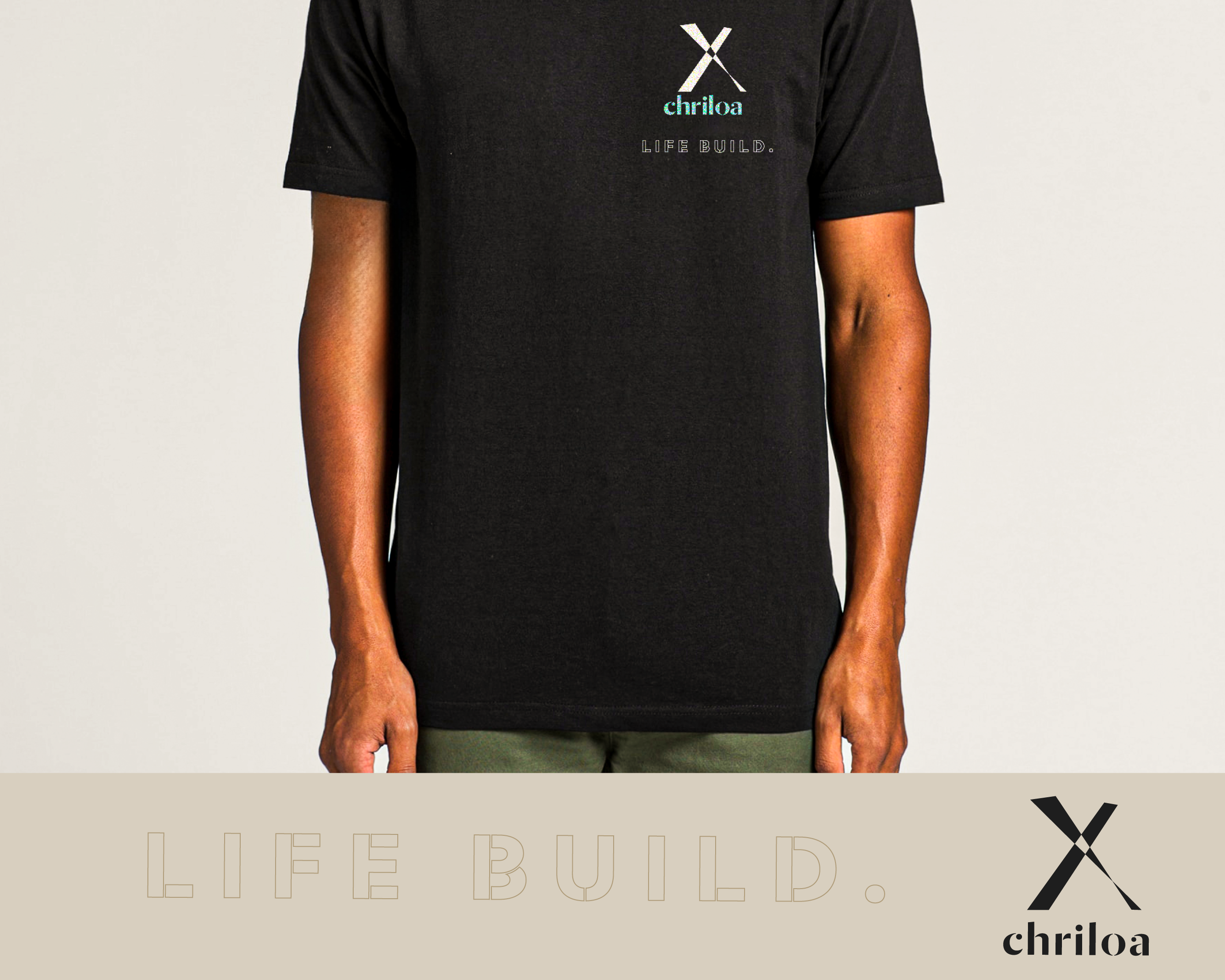
Life Build. The ethos and mission of Chriloa, people building. Chriloa stands out, not only with its unique name but also with its inherent people focus. The challenge? To create a single, unified symbol that encapsulates all these elements.
The logo design pulls its central inspiration from the brand's stencil typography. This approach effectively embodies and symbolizes the critical idea that construction is not merely a task but a sequential, methodical, and meticulously organized process. Each step builds on the preceding one, every bit as essential as the last. Furthermore, the logo structure masterfully plays and employs elements of perspective. This viewpoint illustrates how different geometric shapes and forms can greatly impact and guide the various stages of the construction process.
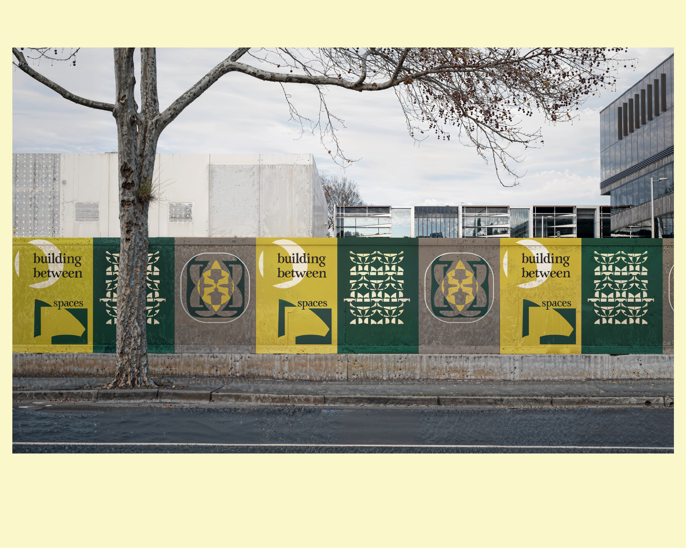
> Established brand identity
> Established ‘Life Build’ expression
> Apparel Design
Typefaces:
Dala Moa, commercial type
Heimat Stencil, Atlas Fonts
Proxima Nova, Mark Simonson Studio
other projects
JesusGen | 2019-2020Event Visual Identity
Chriloa | 2018-2019Brand Identity
Bezalel Projects | 2024Brand Identity

Start your next project
Or email ⟶ jacob@proliminal.design
Designing for people. I simplify user journeys and make complex processes more efficient. My hope is to make digital design more insightful, practical, and human.
Copyright © 2024 Proliminal
REGISTERED SOLE TRADER ABN: 82 981 771 099